
Floor was a consumer web3 app for tracking, discovering, and trading on-chain assets, where I was the founding designer from 2022 to 2024. The portfolio was its core surface: the screen people opened to see what they owned, and the one they screenshotted and shared most. Over three years it grew from a simple single-chain tracker into a cross-chain, social home base. This case study covers the three areas at the center of that work — the home screen, search, and asset details.
Home screen
The home screen is where Floor started and where most of the brand lived, so it's the clearest place to watch the product evolve.
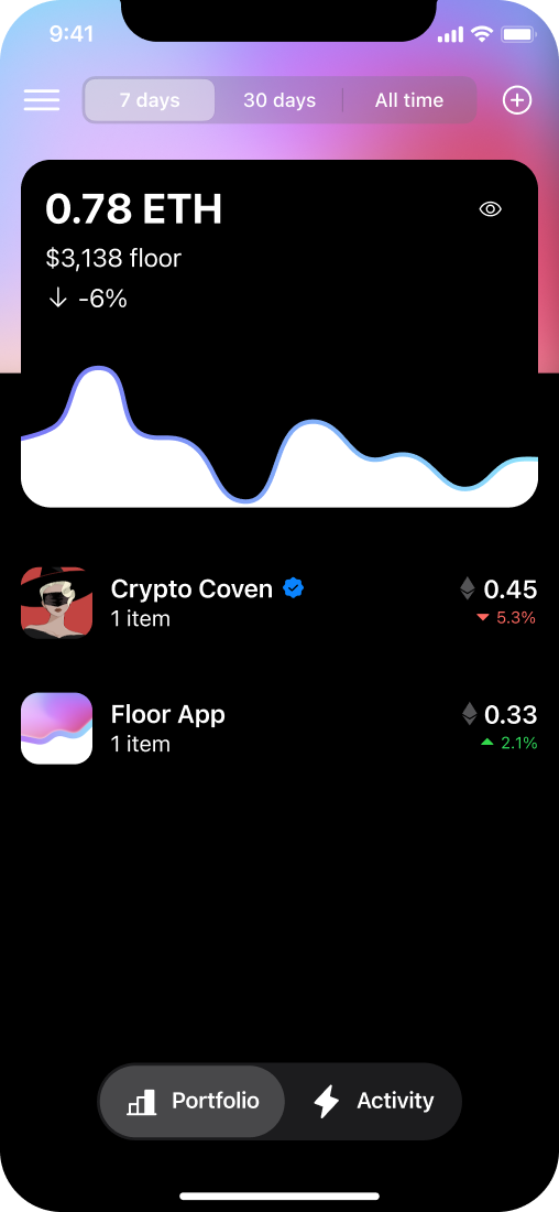
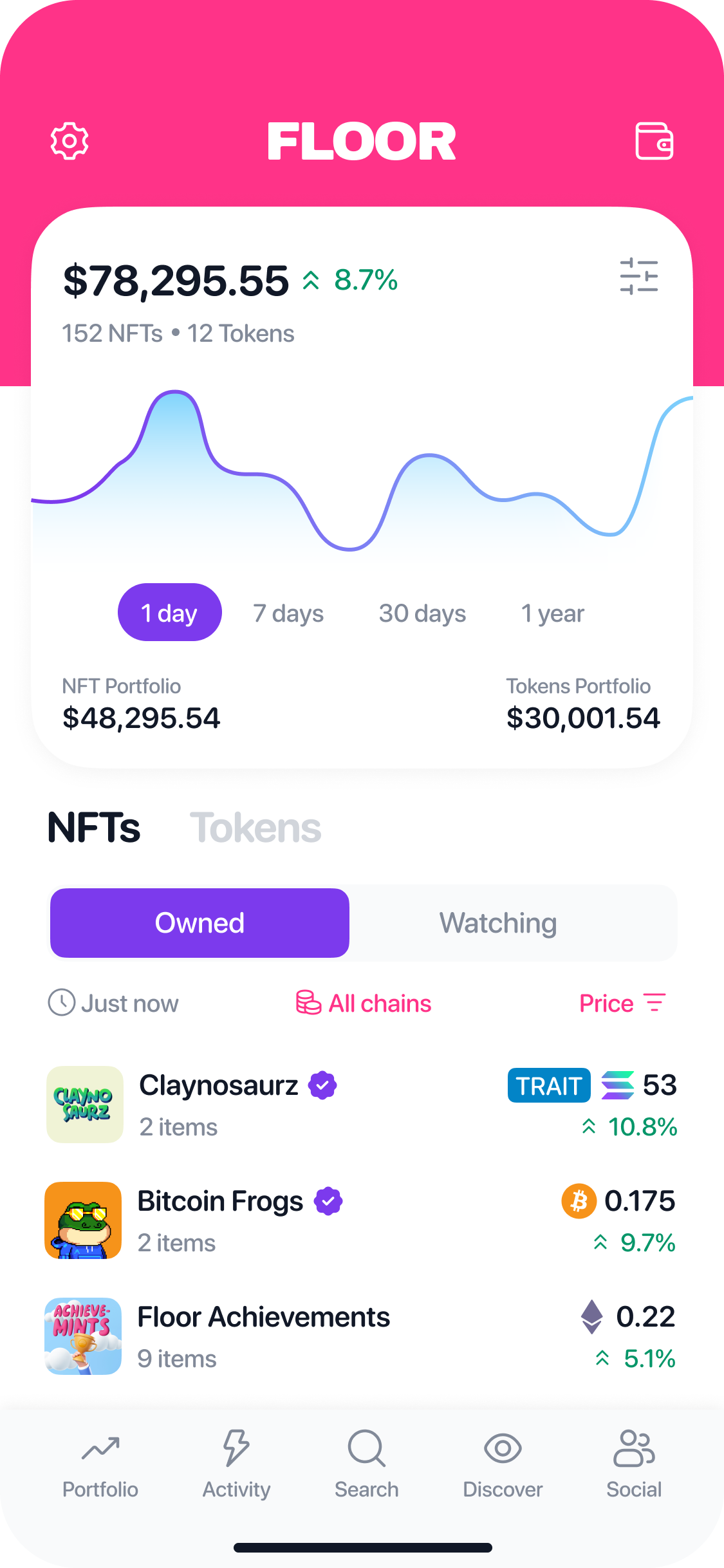
When Chris first reached out, he'd built the MVP himself. It was very simple: your balance in ETH, the fiat value calculated from the real-time ETH price, and a list of what you owned priced at each collection's floor. You could toggle to see activity for your connected wallet — buys and sells.
One of the first things we leaned into after I joined was watching behavior. By bringing it onto the home screen, you could monitor collections that weren't in your wallet — search across ETH, watch them, and see their value move so you could decide whether to buy. We built Discover alongside it to support that.
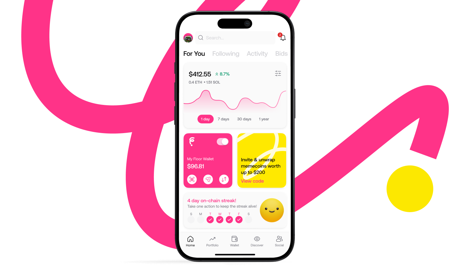
Something I find interesting across three years of development: the home screen didn't change significantly until near the very end. A big reason is that this was the brandable moment. People would screenshot their portfolio and share it on Twitter and in Discord, and the most common question we'd see was "cool, what app is that?" Putting our name at the top of the screen early almost certainly earned us a few more downloads.
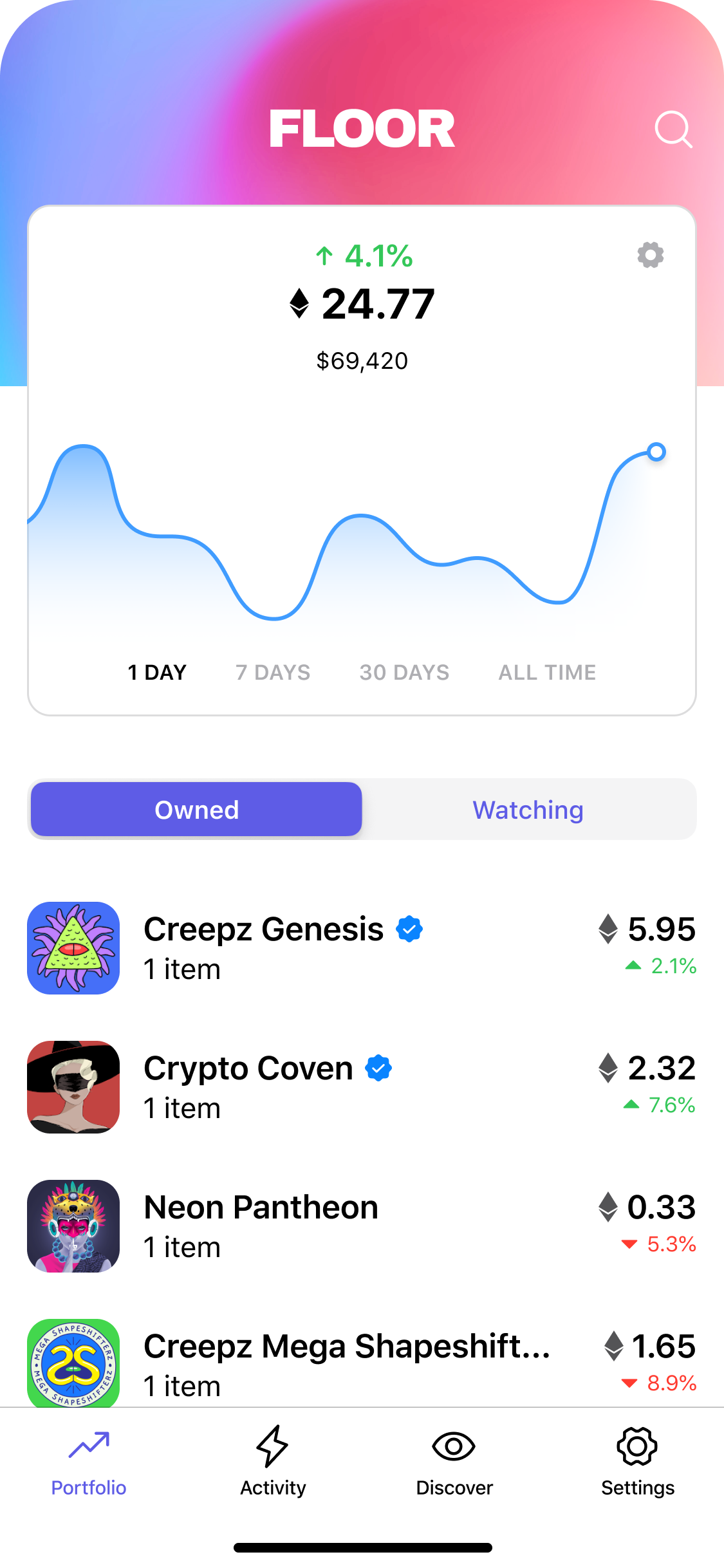
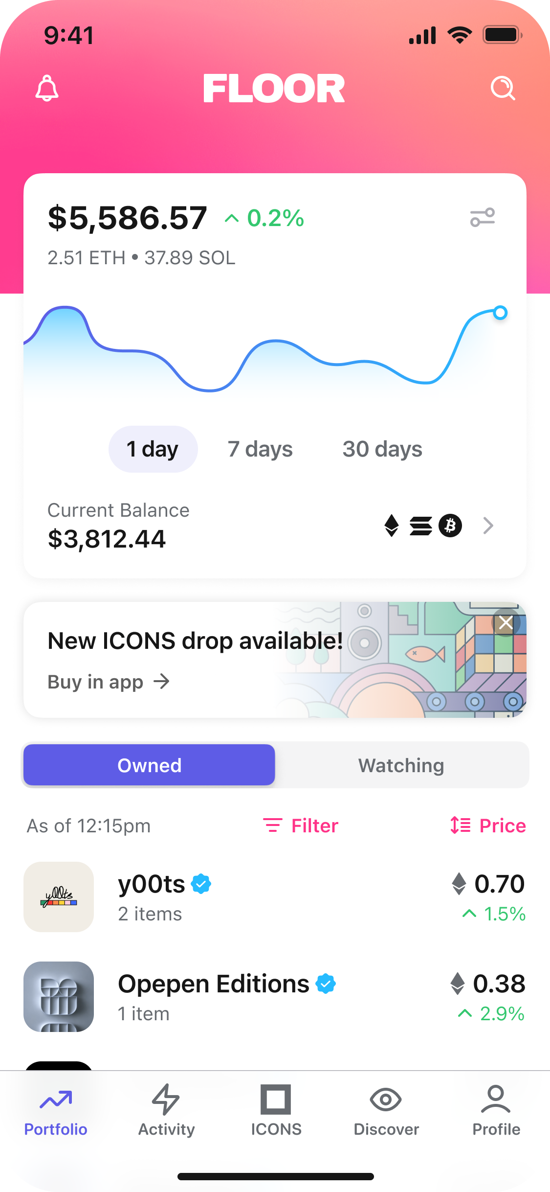
As it evolved, we began allowing cross-chain collections — Solana was the second chain we added — so you could see your balance calculated across chains and over time. We added Icons, our limited-edition artist drops. You could now also see your stablecoin balance: how much ETH, Solana, or Bitcoin you held across connected wallets. The most visible change was a swipeable card gallery that gave the Floor team space on the home screen to promote our in-app Mobile Mints.
The next evolution came when we let you track your token portfolio. Meme coins became a massive movement, and suddenly a web3 portfolio wasn't just NFTs and stablecoins — there was now a third type of asset. We added functionality to support it, and it worked well.
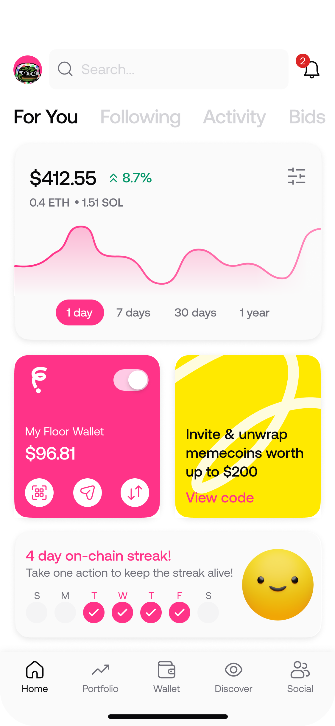
The final version of the Floor home included your portfolio but also a lot more — it became a "for you" screen rather than a portfolio screen. A few big things drove the change. We wanted to surface Floor's wallet the moment a user landed. We wanted to make it easy to invite friends. And the app had become much more social: as trading volume fell across web3, price movement got less interesting, and the experience shifted toward art, memes, and what your friends were doing. This screen captured that better.
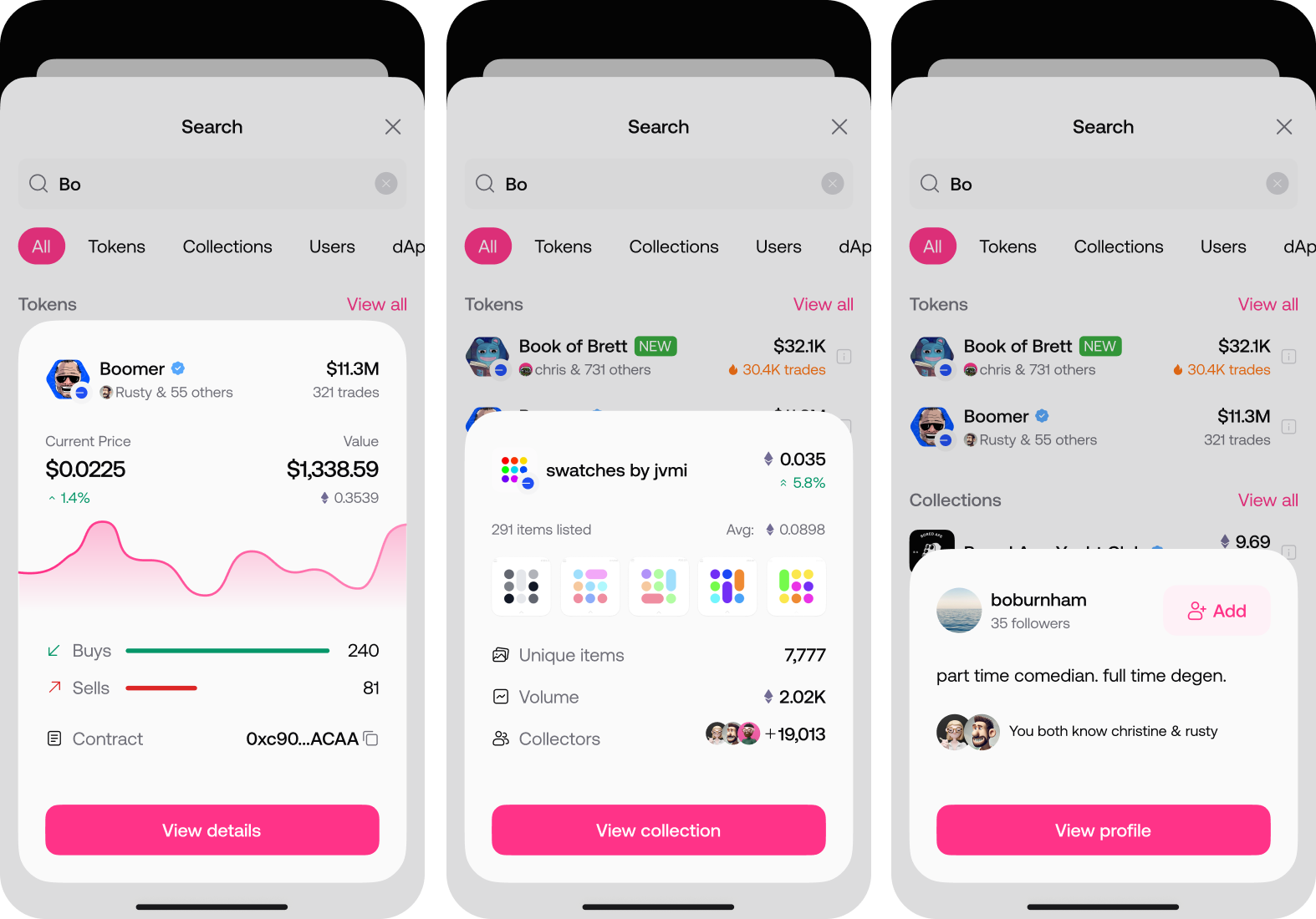
Search and content previews
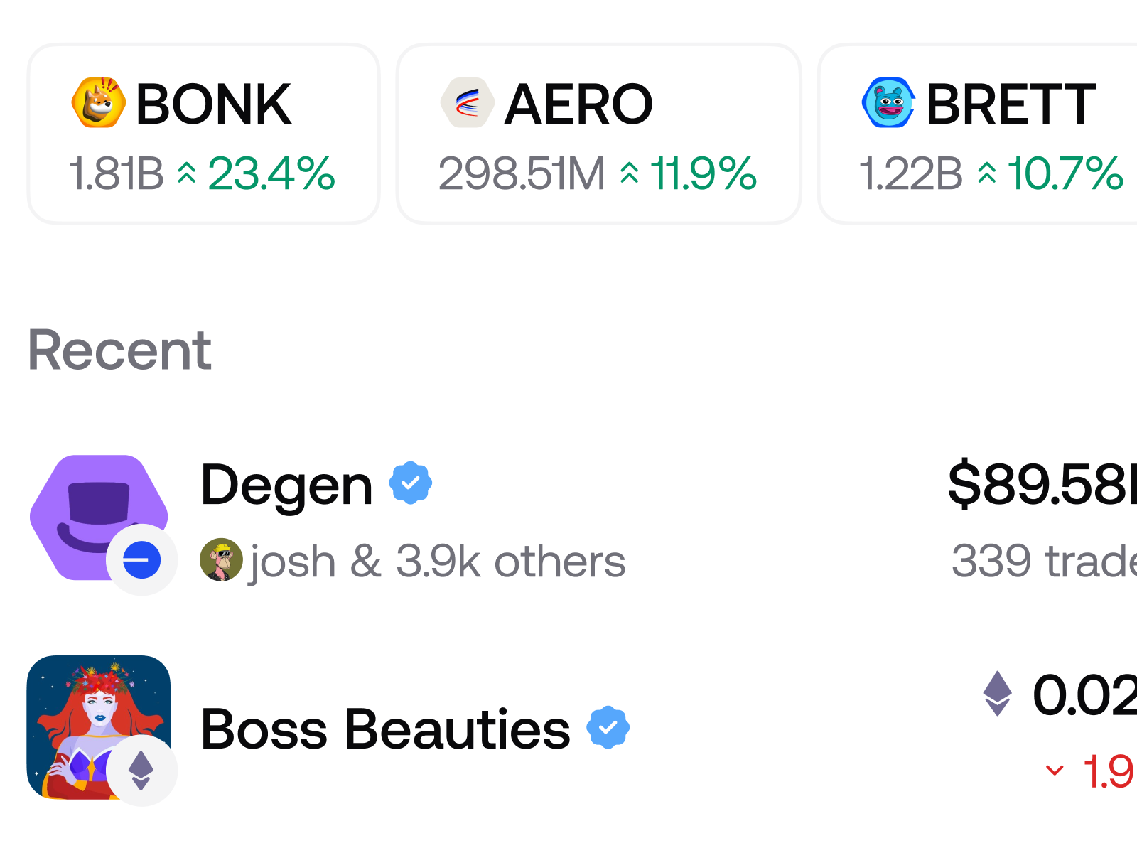
Search was critical to Floor's success. You needed to be able to find people, tokens, and NFT collections — and see the metadata around each — quickly.
One thing we did well was give every category of item its own icon shape: tokens were hexagonal, collections were rounded squares, and users were circles. At a glance, you could tell what kind of item you were looking at.
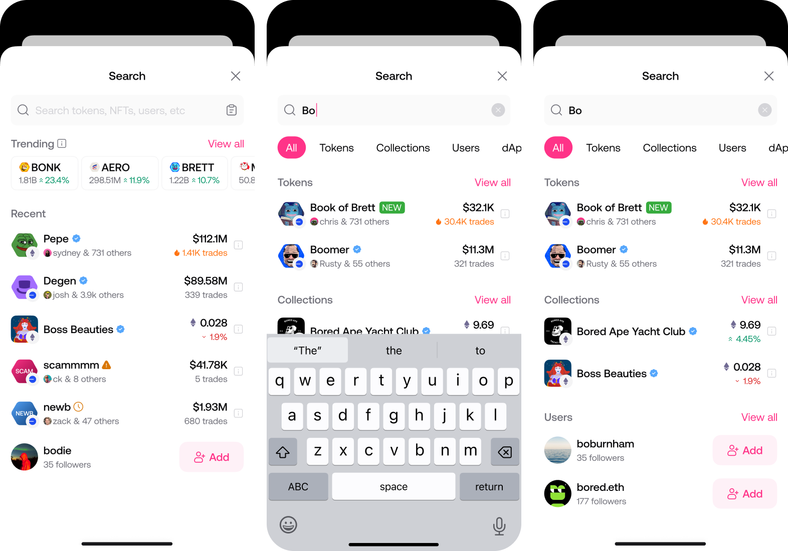
The other piece was preview modals. There was often more information someone wanted without leaving the screen — and in web3 you frequently had multiple collections sharing the same name, so you needed to be sure you were looking at the right one, especially before a purchase. These previews surfaced the information most relevant to the decision you were about to make. For tokens, that was price, buys versus sells, and an easy way to copy the contract address. For NFT collections, it was floor price, items, friends who'd also collected it, and the last one sold. For users, it was adding them as a friend and showing common connections.
Asset details
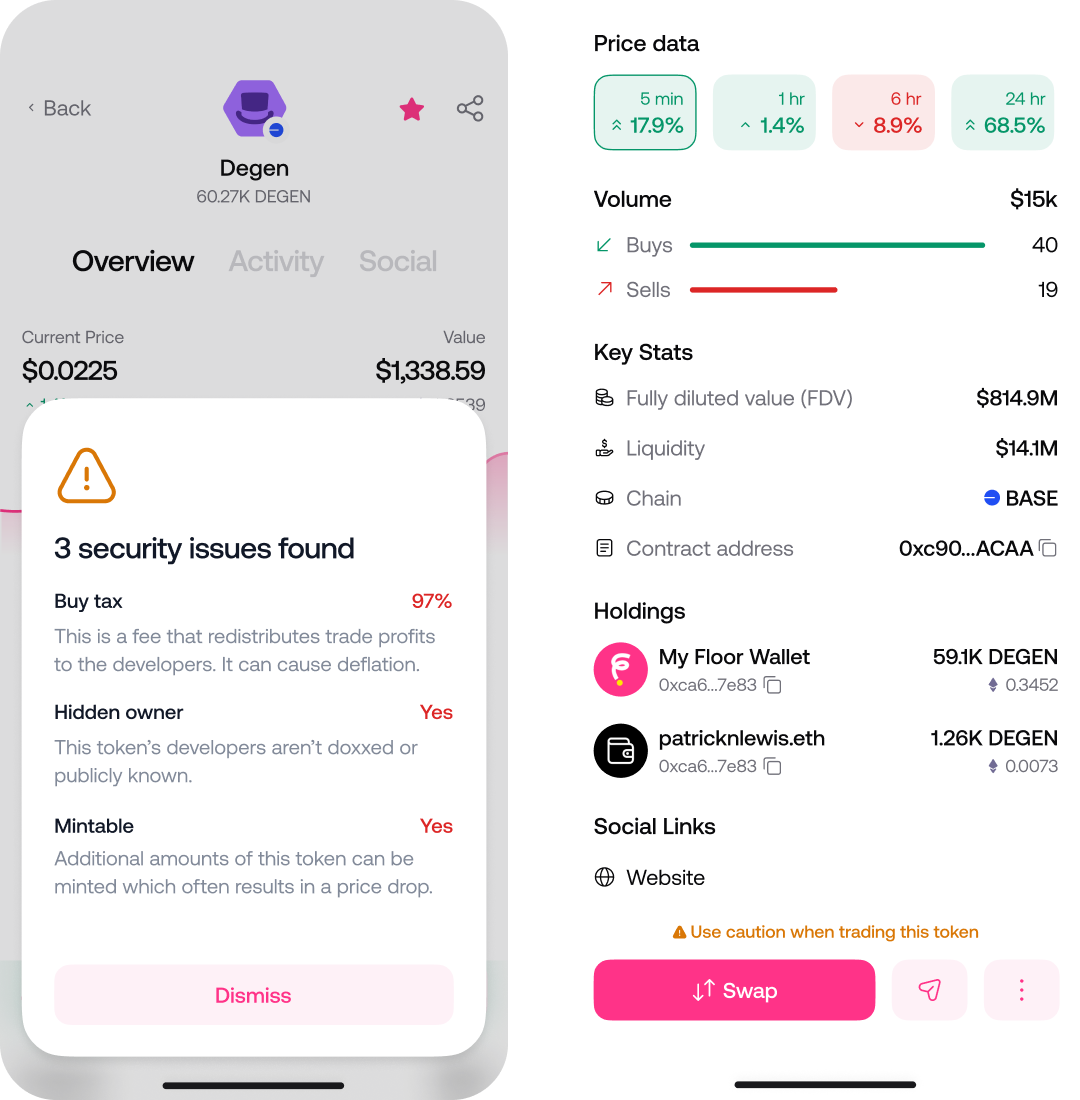
When meme coins became a driving force in web3, we spent real time — for the first time — rethinking the detail view: what a token actually needed to show and what mattered most.
We landed on UI for trading volume, buys versus sells, key stats, and which of your connected wallets held the asset. As with the rest of the product, a big piece was social: one of the higher-priority items on the screen is the other traders, and who you might know that's trading it. You can also send and receive tokens with friends. There were a lot of states to consider in designing the action bar.
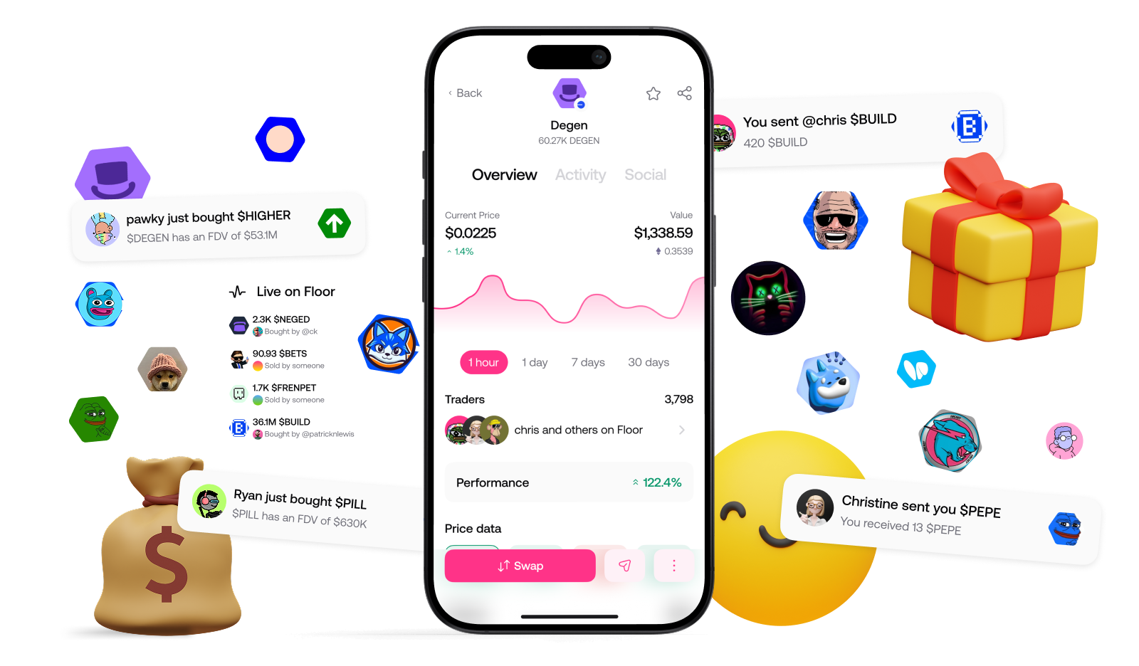
From the beginning, we called Floor the friendliest web3 app — friendly in our community, but also friendly to newcomers. We took security seriously and erred on the side of caution: when a token's contract looked potentially troublesome, we flagged it and surfaced that clearly on the detail view.
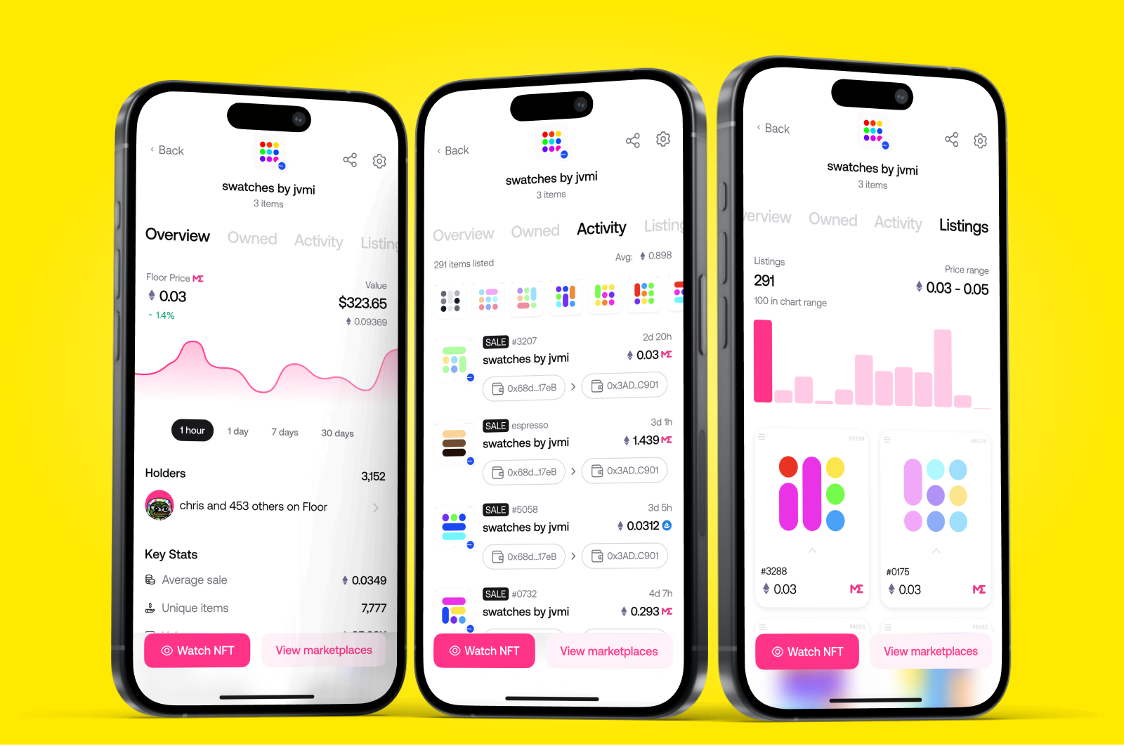
Once the token experience was right, we went back and brought the NFT collection view into consistency with it — price movement, holders, and proper room for a gallery view of the assets you own, down to seeing an individual asset in full detail.
Across three years, the work spanned the full surface of a consumer web3 product: a home screen that grew from a single-chain ETH tracker into a cross-chain, social "for you" feed; a search system tuned to help people find and vet tokens, collections, and other users at a glance; and asset detail views built to support real trading decisions while keeping newcomers safe. Floor hit product-market fit early and grew to around 100,000 users before being acquired by OpenSea.